The Logo Design Journey
One of the most robust units in the introductory course is our multi-phase logo design sequence, which guides students through the full arc of branding from understanding the emotional weight of typography to delivering a professional, scalable logo.
We begin by learning the anatomy, emotional impact, and historical context of typography. Students apply this knowledge to create a wordmark logo for a fictional business, considering how font choice, color theory, and layout communicate a brand’s tone.
Next, students hand-draw their own letterforms, scan them into Photoshop, clean them digitally, and vectorize them in Illustrator. They then use the pen tool to build out their name with graphic elements that symbolize who they are. These personal branding pieces challenge them to design with intention and practice using Illustrator in more advanced, nuanced ways.
The logo sequence culminates in the HCEC-TV Rebrand Project, where students research and redesign the logo for our district’s educational access television station. Working in groups, they conduct competitive analysis, write creative briefs, and present. Final deliverables include mockups, presentations, and in-depth critiques. Students, through this project, gain experience in research-based decision-making, brand strategy, and public speaking.
With the more advanced classes, the students take logo creation a step further with creating marketing and branding materials such as packaging, menus, and promotional products.
Design with Purpose
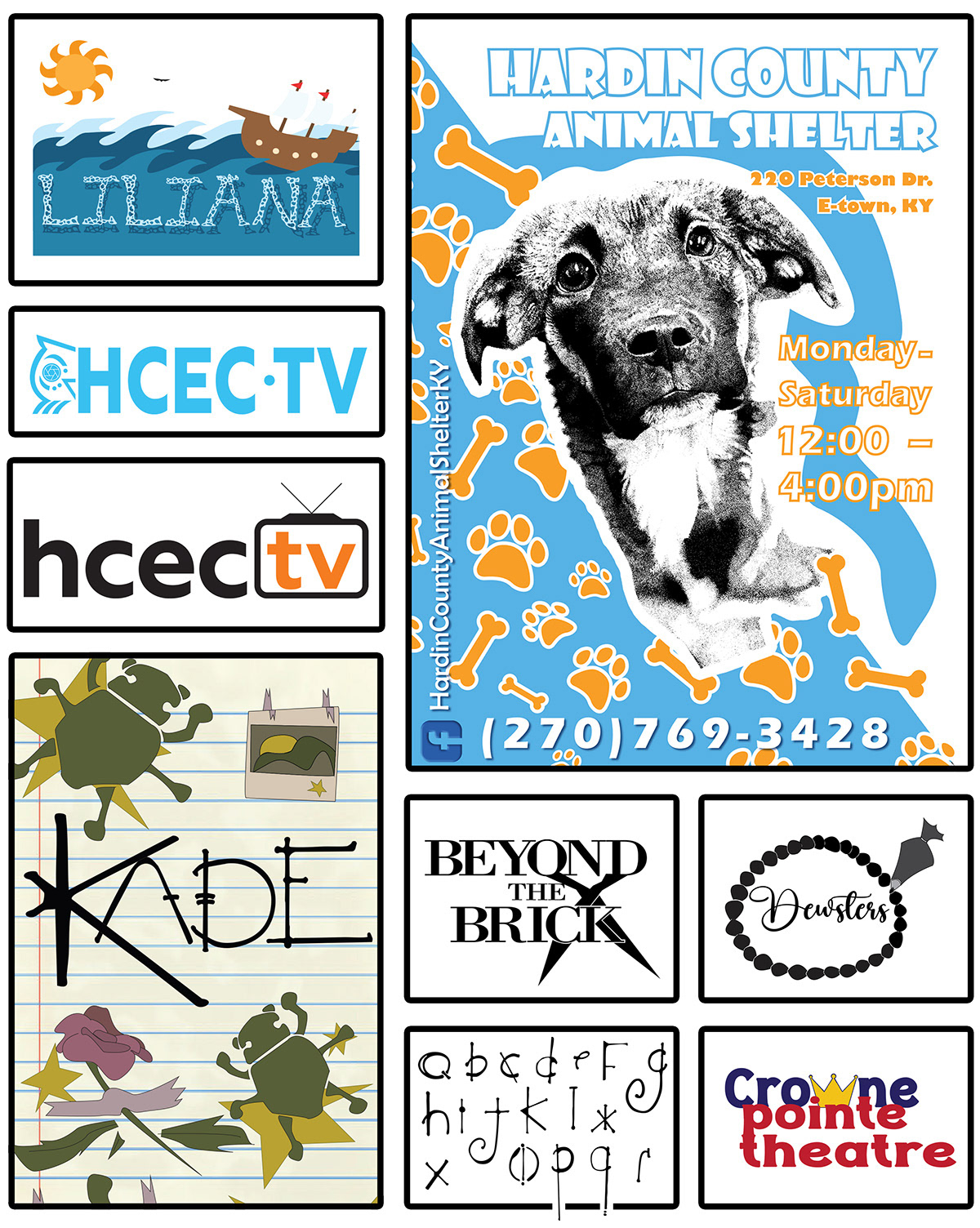
Design becomes real when students see their work used by others, and our class is deeply committed to community-centered projects that connect students to meaningful causes. We have worked in conjunction with the local animal shelters, assisted living facilities, and board of education.
In one project, students partnered with the local animal shelter to create promotional posters for adoptable pets. The collaboration included visual art students, who drew portraits of specific animals. Those portraits were then incorporated into polished graphic designs that were printed, distributed around town, and used by the shelter for digital outreach.
For our Night of the Arts event, students created advertisements that unified all creative disciplines: visual art, band, choir, and media arts. Choir and band students shared music selections, which visual art students translated into expressive paintings. Graphic design students then took those paintings and music themes and turned them into posters that captured the emotional energy of the evening. These projects taught students how to honor other artists' voices, create cross-disciplinary cohesion, and design with both clarity and soul.
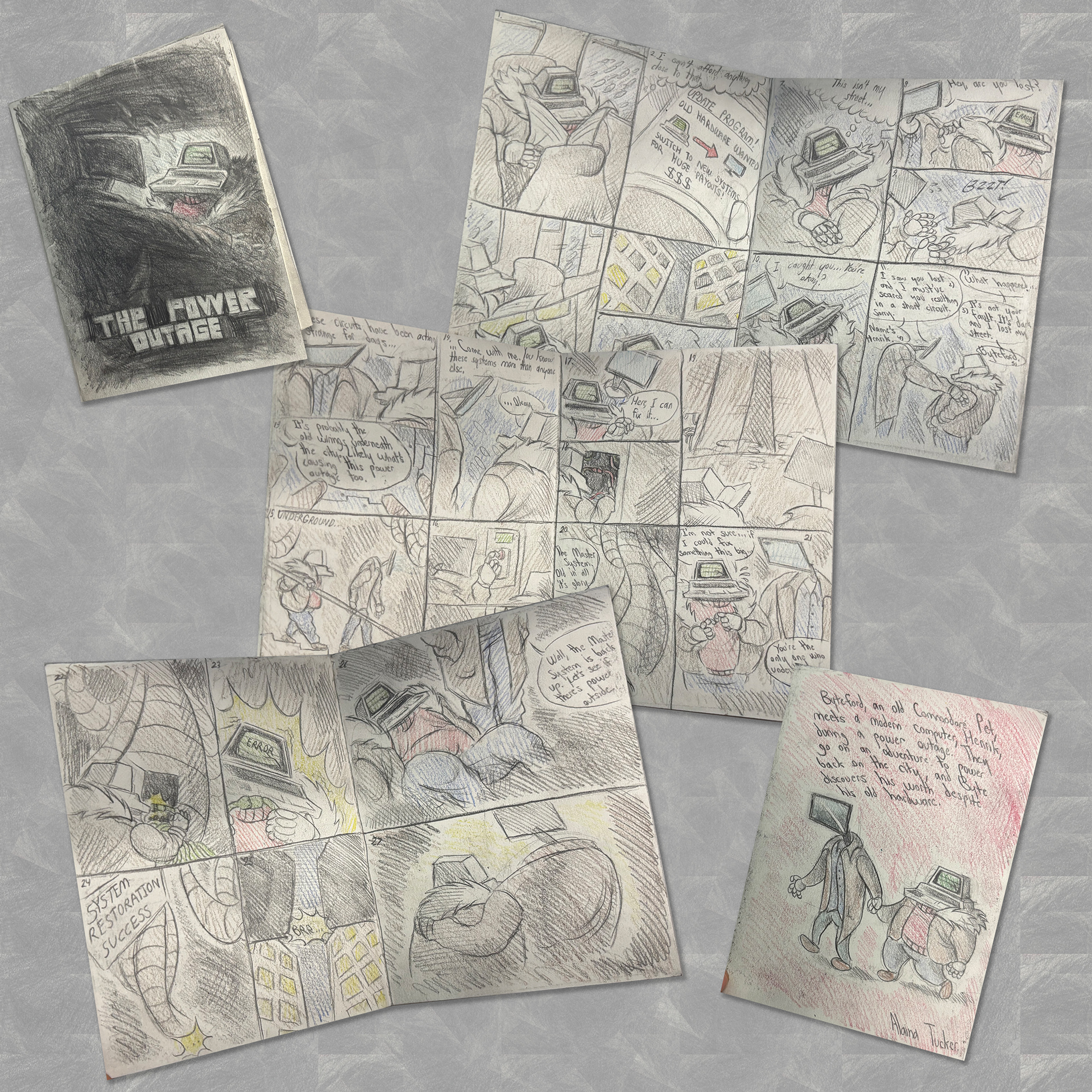
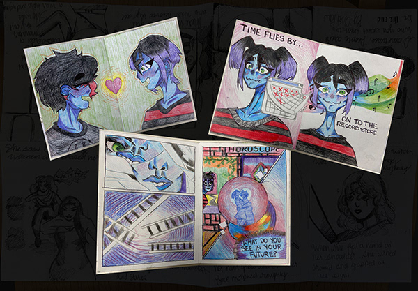
Burtonesque Zine Project (favorite pick)
In this multi-day unit, students learn how distortion, symbolism, and emotion can be used to build a character. A key focus of the project is the recurring theme of the “misunderstood monster.” Many of Burton’s characters are labeled as strange, broken, or frightening because they are different. We examine how these characters often embody vulnerability and loneliness, while the real antagonists are the judgmental townspeople or societal norms that reject what they don’t understand. This theme resonates with many students, especially as we integrate Social Emotional Learning by discussing identity, acceptance, and empathy.
The project unfolds in four main stages:
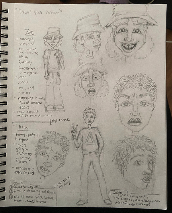
Character Development – Students brainstorm both internal and external traits of original characters, exploring fears, dreams, emotional patterns, and physical quirks. Each student creates a fully colored full-body character illustration and three expressive facial studies.
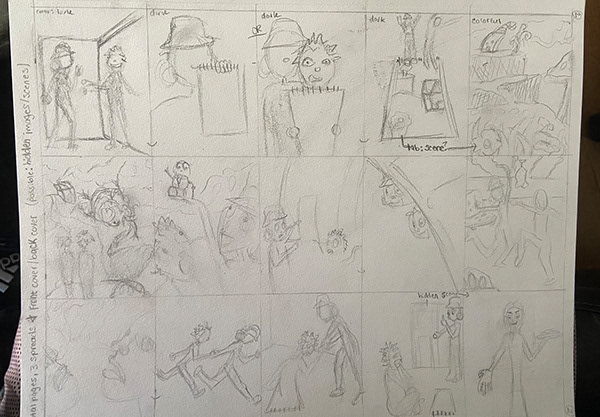
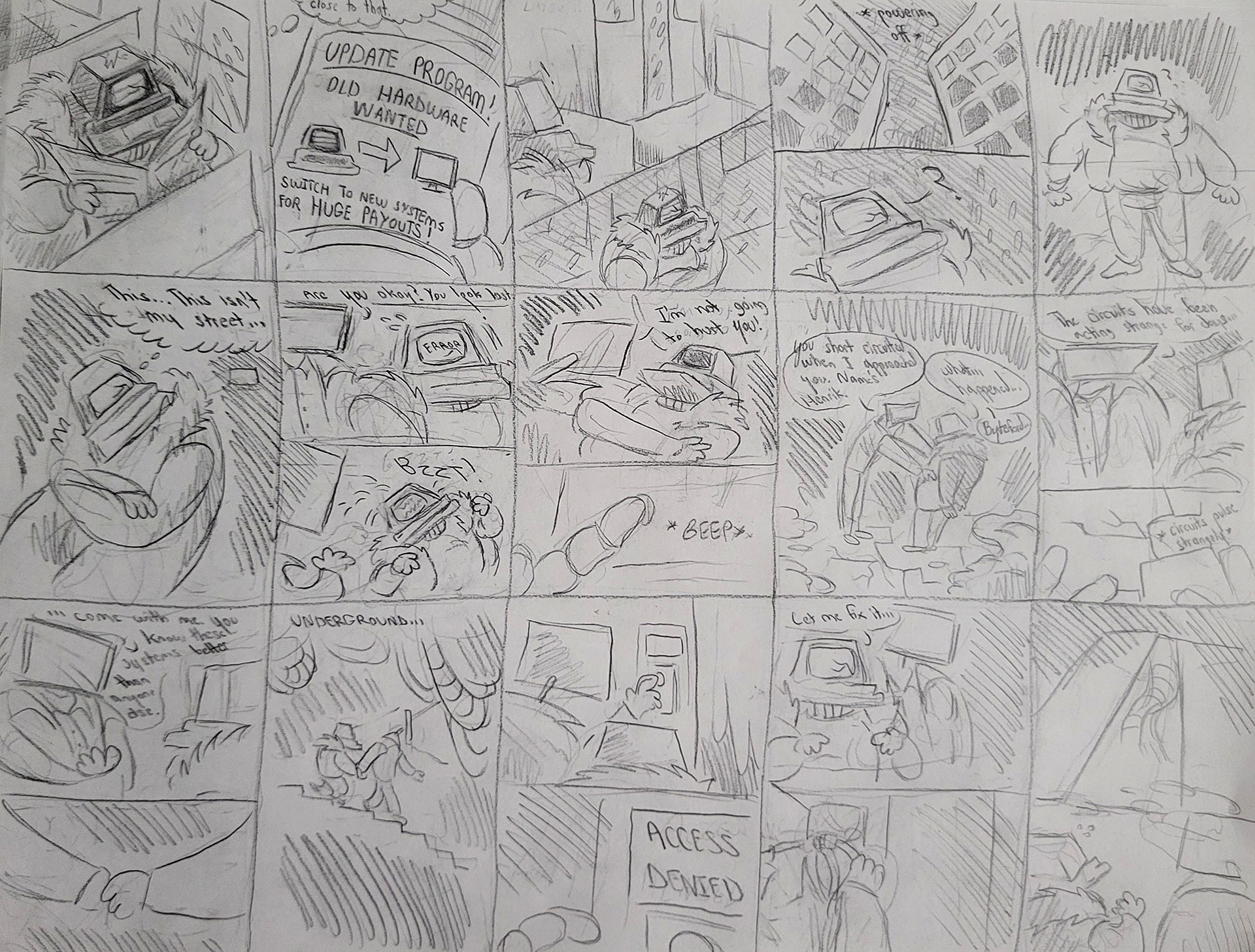
Visual Storytelling – Through a series of videos and discussions, students learn how framing, perspective, shape language, and value can be used to heighten emotion and narrative tension. They sketch a 15-panel, achromatic storyboard that maps out their character’s journey.
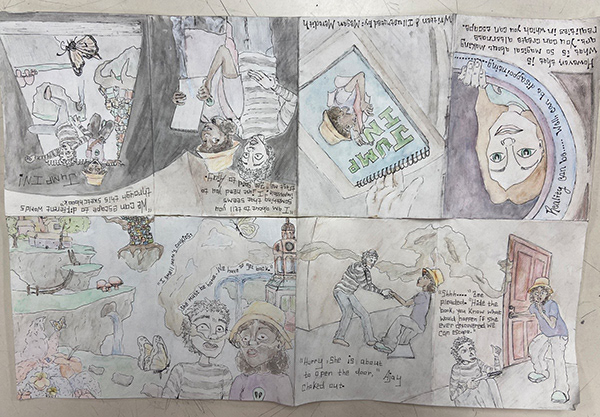
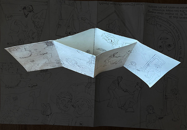
Zine Construction – Students transfer their storyboard into a fully illustrated, handmade one-page zine complete with a cover, back summary, and a hidden element such as a lift-the-flap or secret compartment. This compact format challenges them to think intentionally about visual layout, pacing, and symbolism.
Critique & Reflection – The project concludes with a peer critique session centered on constructive feedback, visual storytelling techniques, and the emotional impact of each zine. Students reflect on their technical choices and how their character’s emotional journey mirrors real-life experiences.